Last Updated on March 14, 2025 by April

Are you looking to give your kitchen a fresh, modern look? Two-toned kitchen cabinets might be just the thing you need! This trendy design style involves using two different colors or finishes on your upper and lower cabinets, creating a visually striking and dynamic appearance that can completely transform your cooking space.
Imagine walking into your kitchen every morning and being greeted by a stunning combination of colors that perfectly reflects your personal style. Whether you prefer bold contrasts or subtle gradations, two-toned cabinets offer endless possibilities for customization. You can mix and match your favorite hues, pair light and dark shades, or even experiment with different textures and materials to create a one-of-a-kind look that’s uniquely yours.

Wood and white
Wood and white kitchens blend warmth with brightness. This classic combination creates a balanced, inviting space that feels both modern and timeless.
You can achieve this look by pairing white cabinetry with wooden countertops or flooring. Alternatively, consider white walls with wooden cabinets for a cozy yet fresh atmosphere.
The contrast between natural wood grain and crisp white surfaces adds visual interest without overwhelming the senses.

Dark green and light green
Pairing dark and light green creates a sophisticated yet harmonious kitchen palette. The combination offers depth while maintaining a nature-inspired aesthetic.
You can use dark green on lower cabinets for grounding, with light green upper cabinets to maintain brightness. This two-tone approach works particularly well in kitchens with ample natural light.
Consider matte finishes for a contemporary look or glossy surfaces for a more traditional feel. Brass or gold hardware complements both green tones beautifully.

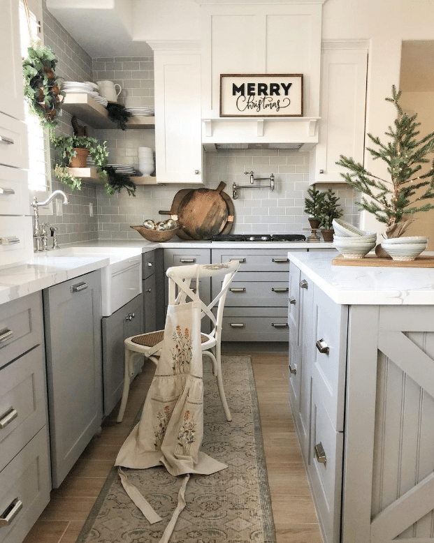
Gray and white
Gray and white kitchens offer a timeless aesthetic that balances sophistication with brightness. This classic combination works in virtually any kitchen style, from modern to traditional.
You can pair light gray cabinets with white countertops for a subtle contrast. Alternatively, try white upper cabinets with gray lowers for a grounded yet airy feel.
Consider adding metallic accents like chrome or brass to enhance the palette’s elegance. Textural elements such as marble with gray veining can add visual interest while maintaining the color scheme.

Beige and white
Beige and white kitchens create a warm, timeless aesthetic that balances neutrality with subtle warmth. This combination works well in both traditional and contemporary spaces.
You can use white for cabinetry and beige for walls to create depth without overwhelming the space. Alternatively, consider beige lower cabinets with white uppers to ground the design while maintaining an airy feel.
Natural materials like wooden accents or stone countertops complement this palette beautifully. For added interest, incorporate textural elements such as woven pendants or tactile backsplashes.

Medium wood and white
Medium-toned wood paired with white creates a timeless kitchen aesthetic. This combination brings warmth through wood elements while maintaining brightness with white components.
You can implement this by using medium wood for cabinetry with white countertops. Alternatively, consider white upper cabinets with medium wood lowers for a balanced look.
This pairing works well in both contemporary and traditional kitchen designs. The neutral palette allows for easy accessorizing with colorful decor items or metallic fixtures.

Black and white
Black and white kitchens offer a timeless contrast that never goes out of style. This classic color combination provides a clean, sophisticated look that can adapt to various design preferences.
You can implement this duo through black cabinets with white countertops or vice versa. The stark contrast creates visual interest without introducing complex color schemes.
Consider black appliances against white walls or a black island with white perimeter cabinets. Adding small touches like black hardware on white cabinets can also achieve this elegant look without overwhelming the space.

Dark and light blue
Blue tones can create a striking two-tone kitchen that feels both classic and contemporary. Pairing navy or midnight blue with a pale sky or duck egg blue creates beautiful depth and dimension.
You can use darker blues for lower cabinets to ground the space, while lighter blues work well for wall cabinets to maintain an airy feel. This color combination pairs beautifully with brass or copper hardware for a touch of warmth.
Consider incorporating these blues through backsplashes or accessories if you’re hesitant to commit to colored cabinetry.

Black and wood
Black and wood combinations create a sleek, contemporary look in your kitchen. The contrast between dark cabinetry and warm wood tones adds depth and visual interest.
You can achieve this style with black painted cabinets and wooden countertops or shelving. Alternatively, consider wood cabinets with black hardware and appliances for a subtler approach.

Black and wood
Black and wood kitchens offer a sophisticated pairing that balances darkness with warmth. You can incorporate this striking contrast through matte black cabinetry with wooden countertops or vice versa.
Consider adding wooden open shelving against black walls for an eye-catching display space. Wood accents like bar stools or cutting boards can soften the boldness of black elements.
This combination works in both modern and traditional settings, giving you flexibility in design approach.

Wood and white
Wood and white kitchens blend warmth with crisp cleanliness for a timeless appeal. Natural wood elements add texture and organic character against clean white surfaces.
You can incorporate this combination through white cabinetry with wood countertops or vice versa. Consider wood open shelving against white walls for a balanced contrast that feels both cozy and fresh.
For subtle integration, try white cabinets with wood accents like drawer pulls or a wooden range hood. This approach maintains brightness while introducing warmth through strategic wooden elements.

Beige and green
Beige and green create a naturally harmonious kitchen palette that balances warmth and freshness. You can incorporate sage green cabinets with beige countertops for a subtle contrast.
For a bolder approach, try deep forest green islands against beige walls and wooden accents. Light fixtures in brass or copper add warmth that complements both colors beautifully.
This color combination works well in both modern and traditional kitchen designs. You can easily adjust the intensity of either color to match your preference for drama or subtlety.

White and blue
White and blue kitchens create a timeless, refreshing atmosphere that works in spaces of all sizes. This classic color combination offers versatility while maintaining a clean, crisp appearance.
You can incorporate blue through cabinetry or an island against white walls for a striking contrast. Alternatively, white upper cabinets paired with blue lowers create visual balance without overwhelming the space.
Consider navy for a sophisticated look or lighter blue tones for a more airy, coastal feel. Small accessories like blue vases or dishware make excellent accents if you prefer a subtler approach.

Wood and black
Wood and black is a timeless combination that adds warmth and contrast to your kitchen. Natural wood elements bring texture and organic appeal, while black accents create definition and sophistication.
You can incorporate this duo through black cabinetry paired with wooden countertops or vice versa. Another approach is using black fixtures and hardware against wooden cabinets for a subtle yet striking effect.
This pairing works with multiple wood tones, from light oak to rich walnut. For modern kitchens, consider sleek black appliances against wooden backdrops to create a cohesive look.
Gray and white
Gray and white kitchens offer a timeless aesthetic that balances sophistication with brightness. This classic color combination provides a neutral backdrop that works with virtually any accent color or design style.
You can incorporate this duo through gray cabinetry with white countertops, or vice versa. The contrast creates visual interest while maintaining a cohesive, elegant look.
For added dimension, consider varying shades of gray alongside crisp whites. This approach adds depth without overwhelming the space.

White and green
White and green kitchens create a fresh, natural aesthetic that balances brightness with organic warmth. This combination works beautifully in both contemporary and traditional spaces.
You can incorporate green through cabinetry, with white walls providing a crisp backdrop. Alternatively, use white cabinetry with green walls for a bold statement.
Consider varying shades—from sage and mint to emerald and forest green—to achieve different moods. Add wooden elements for texture and warmth that complement this color pairing perfectly.

Blue and greige
Blue and greige create a sophisticated two-toned kitchen combination that balances cool and warm elements. The calming blue adds character while greige provides a neutral backdrop.
You can incorporate this duo through blue cabinets with greige walls or vice versa. This pairing works well in both contemporary and traditional kitchen designs.

Yellow and white
Yellow and white kitchens create a fresh, cheerful atmosphere that’s both timeless and uplifting. The contrast between bright yellow accents and crisp white surfaces brings warmth and energy to your cooking space.
You can incorporate yellow through cabinet doors, a statement backsplash, or accessories while keeping walls and countertops white for balance. This combination works especially well in spaces that need a bit more light and vibrancy.
For a more subtle approach, consider pale lemon tones paired with off-white surfaces. The result is a kitchen that feels sunny and inviting without overwhelming the senses.


